FIRST ONE

When people talking about minotaur I thinking about strong, weight lifting. So I designed those logos for local weight lifting team in VICTORIA. I want to create a strong arm lifting a dumbbell, The dumbbell bended ,shows very heavy. We can see the bleed vessel on the arm appeared clearly, expressed him using too much strength. About the name, I combine "VIC" for Victoria and "taur" for bull in Italian, so it calls "Victaur".
SECOND ONE
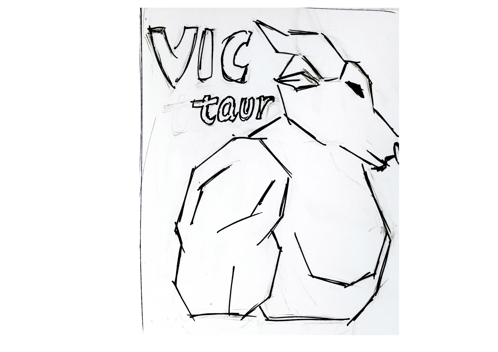
Straight lines can demonstrate taught, power and modern. So I using very straight lines to show how taught the bull is, straight line can also express the muscles very well.
THIRD ONE

This logo is for foot ball team, "VICTAUR" is the team's name, this logo combine letter "V",letter "M" and corners together, "V" stand for Victoria, "M" stand for Minotaur, the shape is also like an Japanese sammurai's helmet. expresses this team has bull's taught and summurai's cruel. want to cash every opponent block them.
Out of the three images shown, it is my personal opinion that the second logo drawn is the strongest design. I believe that minotaur would create a very good mascot, it is very much like the AFL team mascot that was drawn back in the 1990s. With more development this could be a very strong design. I would however like to see some ideas of a colour scheme.
ReplyDelete